For my special studies, I have chosen to write about logo’s, both how they are designed and how effective they are to their cause. We take logo’s for granted, we see them every day, whether its clothes, food, technology, games and much more. Everything has a logo but some are more effective to remember than others, why is this you may ask, well its because so many companies have spent large sums of money to produce a logo to catch the eyes and attentions of its audiences. Many sports logos are well known such as Adidas, Nike and even Umbro, let’s take a look at the Umbro logo. It is recognised by the diamond shape with another inside it, it is effective because it is small picture which can be placed onto any product owned by Umbro instead of the company having to write out “this is a product of Umbro clothes, footwear and sport supplies manufacturer and distributor”.

The Umbro logo has come a long way since 1924 from a diamond shape with the word Umbro inside to its modern day look, the double diamond was considered a fashion statement by footballers and ‘Rock stars took the stage wearing drilltops with the giant Umbro double diamond on the chest. A much cooler kind of bling’. Even today the Umbro logo is recognised by all footballs players and supporters.
It is important to have a good logo and the only way to get a good logo is to spend time, money and effort on finding out what will not only connect your product to the logo but what will also catch the eye of your audience. Logos come in many different shapes and sizes from single symbols such as the Internet Explorer logo to the Apple logo.


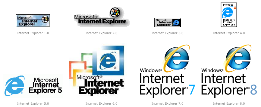
We recognise these logos for different purposes, for the internet explorer logo we notice the letter e is always in blue with the yellow ring around it, but this logo did not originally look like this. The internet explorer logo for version 1.0 started out as a small box with the words Microsoft Internet Explorer and they used the Windows logo in the corner, this logo design continued to version 2.0 with a slight different, the logo was not contained within a box form but kept the same style using the same text and the windows logo. By version 3.0 internet explorer had altered there logo, this time by adding in a new symbol, the blue e instead of the Windows logo. This use of the blue e continued to be used right up to present day with the latest Internet Explorer version 9.0 and is commonly recognised around the world.
The Apple logo has evolved a lot as well, the first ever design of the Apple logo was produced by Ronald Wayne in 1976. The original logo ‘depicts Isaac Newton sitting under a tree, an apple dangling precipitously above his head’, there is also some text around the outside boarder which reads “Newton… A Mind Forever Voyaging Through Strange Seas of Thought … Alone.”, but this logo only lasted a year until a new graphics designer was employed to design something much more modern. This new designer came up with something so fantastic it would ‘go on to become one of the most iconic and recognizable corporate logos in history’, the designer Rob Janoff developed the rainbow apple to be a much more modern style, Janoff had said the reasoning for the ‘bite’ in the side was so people could tell it was an apple not a tomato. This logo lasted 22 years until Steve Jobs returned to Apple and began to revamp the company, in doing this he decided to remake the logo because placing a rainbow apple would look childish and unprofessional, but it was the perfect logo. So it was decided the apple symbol would remain but a more modern and professional look would have to be added which is where the now commonly recognised Monochrome styled apple logo has come into play.
 A logo which is known worldwide by thousands if not millions of people is the Google logo. This logo is recognised threw its use of colour and its use of text font. This logo is known by people all over the world of so many different ages, it is the logo most people can connect to and understand what it’s about. Google is now one of the biggest internet companies who are in the fight for the top. This logo has been such a successful tool, the original name for this search engine was BackRub but in 1997 Larry Page and Sergey Brin the creators of BackRub needed a new name, so they brainstormed until they came up with Google, this word was a play on words from “googol” a “a mathematical term for the number represented by the numeral 1 followed by 100 zeros. The use of the term reflects their mission to organise a seemingly infinite amount of information on the web.” Google has expanded exponentially and the logo appears on the website in many different forms but is still recognised globally as one of the world’s top online search engines.
So what have I learnt, well I’ve learnt that coming up with a logo is tricky and the best logos have some good meanings behind them or were designed to fit purpose of time and era but the main things that are needed to take into consideration when designing a logo are:
- What the company is trying to sell.
- What can be connected to the company in a form of a picture, or text or a mix of both.
- If a specific theme could be matched to the company i.e. colour, size.
- Not to have too much going on in the logo, something simply but eye catching.
- Something unique to that company or organisation, something that clearly says what the company is without being over the top.
- Make sure it stands out above every other logo.
- What logos are already out and why are they eye catching?
With these components put together by the right minds then there is no doubt I good logo can be made to attract the attention of targeted audiences … and who knows the next big company logo to come out could be my own design.
References:

